It's been a long time coming, but I finally pushed out a new design for this website last month. I rebuilt it from the ground up using two key tools from the Yahoo! Developer Network:
- YUI Grids and
- YSlow
The new design is really a refresh of the previous look with a focus on readability and speed. I want to take a few minutes and touch on what I learned during this go-round so (hopefully) others might benefit.
Color Scheme
Although I really liked the darker color scheme from before, it was too hard to read. There simply wasn't enough contrast between the body text and the black background. I tried my best to make it work — I searched around for various articles about text legibility on dark backgrounds. I increased the letter spacing, the leading, narrowed the body columns, and everything else I learned in the intro graphic design class I took in college. The results were better, but my gut agreed with all the articles I read online which basically said "don't do it." So I compromised and switched to a white body background, while leaving the header mostly untouched. I find the new look much more readable — hopefully this will encourage me to begin writing longer posts.
CSS and Semantic Structure
The old site was built piecemeal over a couple months and, quite frankly, turned into a mess font-wise. I had inconsistent headers, font-weights, and anchor styles depending on which section you were viewing. With the new design, I sat down (as I should have before) and decided explicitly on which font family, size, and color to use for each header. I specced out the font sizes using YUI's percent-based scheme which helps ensure a consistent look when users adjust the size. (Go ahead, scale the font size up and down.) An added bonus was that it forced me to think more about the semantic structure of my markup. (If you have Firefox's Web Developer toolbar installed, try viewing the site with stylesheets turned off.) If there's one thing I learned working for Sitening, it's that semantic structure plays a huge part in your SERPs.
Optimizing With YSlow
At OSCON last summer, I attended one of the first talks Steve Souders gave on YSlow — a Firefox plugin that measures website performance. That, plus working for Yahoo!, has kept the techniques suggested by YSlow in the back of my head with every site I build. But this redesign was the first time I committed to scoring as high as I could.
As usual, I coded everything by hand, paying attention to all the typical SEO rules that I learned at Sitening. Once the initial design was complete and I had a working home page, I ran YSlow.
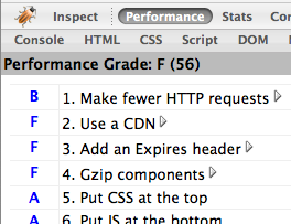
Ouch. A failing 56 out of 100. What did YSlow suggest I improve? And how did I fix it?
- Make fewer HTTP requests - My site was including too many files. Three CSS stylesheets, four JavaScript files, plus any images on the page. I can't cut down on the amount of images (without resorting to using sprites - which are usually more trouble than they're worth), so I concatenated my CSS and JS into single files. That removed five requests and brought me up to an "A" ranking for that category. (I'm further toying with adding the YUI Compressor into the mix.)
- Use a content delivery network - At Yahoo! we put all static files on Akamai. Other large websites like Facebook, Google, and MySpace push to their own CDNs, too. But what's a single developer to do? Use Amazon S3 of course! I put together a quick PHP script which syncs all of my static content (images, css, js) and stores them on S3. Throughout the site, I prepend each link with a PHP variable that lets me switch the CDN on or off depending on if I'm running locally or on my production server. (And, in the event S3 ever goes down or away, I can quick switch back to serving files off my own domain.)
- Add expiry headers - Expiry headers tell the browser to cache static content and not attempt to reload it on each page view. I didn't want to put a far future header on my PHP files (since they change often), but I did add them to all of the content stored on S3. This is fine for images that should never change, but for my JavaScript and CSS files it means I need to change their filename whenever I push out a new update so the browser knows to re-download the content. It's extra work on my part, but it pays off later on.
- Gzip files - This fix comes in two parts. First, I modified Apache to serve gzipped content if the browser supports it (most do) — not only does this cut down on transfer time, but it also decreases the amount of bandwidth I'm serving. But what about content coming from S3? Amazon doesn't support gzipping content natively. Instead, in addition to the static files stored there, I also uploaded their gzipped counterparts. Then, using PHP, I change the HTML links to reference the gzip versions if I detect the user's browser can handle it.
- Configure ETags - ETags are a hash provided by the webserver that the browser can use to determine if a file has been modified before downloading it. Amazon S3 automatically generates ETags for every file — it's just a free benefit of using S3 as my CDN.
So, all of the changes above took about three hours to implement. Most of that time was spent writing my S3 deploy script and figuring out how to make Amazon serve gzipped content. Was it worth it? See for yourself.
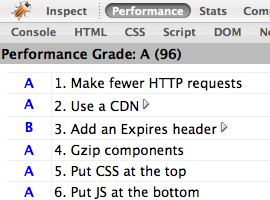
Wow. Three short hours of work and I jumped to a near perfect 96 out of 100. The only remaining penalty is from not serving an expires header on my Mint JavaScript.
Do these optimization techniques make a difference? I think so. Visually, I can tell there's a huge increase in page rendering time on both Firefox and Safari. (IE accounts for 6% of my traffic, so I don't bother testing there any longer.) More amazing, perhaps, is the site's performance on iPhone. The page doesn't just load — it appears.
I've made a bunch of vague references to the S3 deploy script I'm using and how to setup gzip on Amazon. In the interest of space, I've left out the specifics. If you're interested, email me with any questions and I'll be happy to help.